The Palette of Trust
Colors That Connect: Crafting Community Through Every Shade
In the heart of every community lies a promise—a promise not just spoken, but seen. At New Fresh Supermarket, that promise begins with color.
Even from afar, it catches the eye: a beacon of warmth amid the urban rhythm. The vibrant amber of the awning, glowing like a harvest sun, and the crisp mint-green accents that frame the entrance—these are not accidents. They are an invitation. Long before you step inside, the colors whisper, “Come closer. There’s life here.”
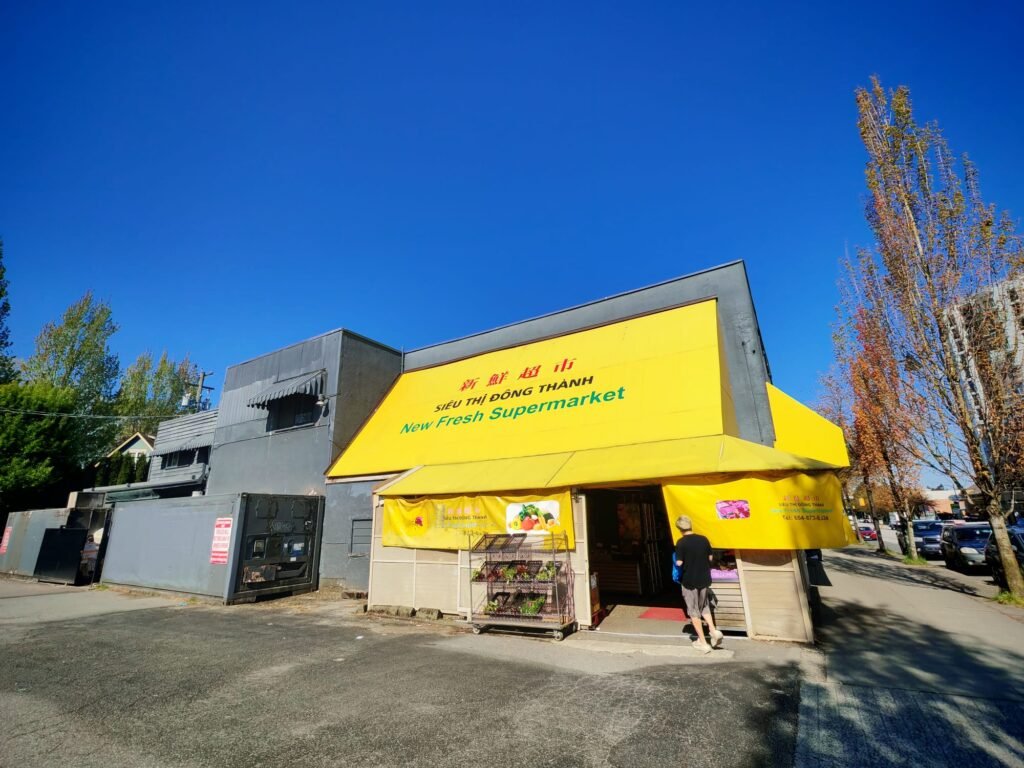
Look closely at the hues woven into our story: 36° BF 133° 115°. These aren’t mere numbers. They are the coordinates of trust—a golden 36° amber, the kind that bathes a morning market in sunlight. They are the 133° green of crisp spinach leaves, whispering growth and renewal. They are the 115° cerulean of a dependable sky, steady as our pledge to serve. Together, they form a symphony of intention, a visual language that says, “Here, you belong.”
SIEU TIN DONG THANH—“Great Trust in Đồng Thành”—is not just a slogan. It’s a story painted in every aisle. The terracotta floors ground us in humility, the citrus-orange signage sparks joy, and the mint-tinted walls breathe life into every interaction. These colors don’t decorate; they communicate. They guide a mother to the ripest tomatoes, nudge a child toward honey-drenched mangoes, and assure an elder that their loyalty is cherished.
It frames a philosophy: that color is the quietest yet loudest storyteller.
This photograph captures more than a supermarket. It frames a philosophy: that color is the quietest yet loudest storyteller. It turns spaces into sanctuaries and transactions into relationships. At New Fresh, we don’t just sell food—we curate experiences, one thoughtful shade at a time.
Our palette is no accident. It’s a magnet. From blocks away, the amber awning stands as a landmark—a promise of freshness, a nod to tradition, and a modern embrace all at once. It’s why neighbors pause mid-stride, why first-time visitors linger at the entrance, and why regulars feel a quiet pride as they return. These colors are more than branding; they’re a bridge between the familiar and the extraordinary.
Because true authority isn’t shouted. It’s felt in the warmth of a palette chosen with care, in the humility of serving a community’s needs, and in the quiet confidence that every hue has a purpose. This is how stories endure.
And this is how we write ours—not with ink, but with light.
From its eye-catching awning to the subtle tones within, New Fresh Supermarket’s colors are a masterclass in visual storytelling. This narrative demonstrates how strategic color choices—both bold and nuanced—can transform a space into a living, breathing symbol of trust and belonging.